1. What Makes a Good SaaS Product Demo Video?
A SaaS product demo video shows how software works by following a specific task or workflow.
Before building a storyboard, establish what the user wants to accomplish. Then structure the demonstration around three stages.
Action
What does the user do? This could be selecting a filter, scanning a QR code, creating an automation rule, or assigning a task.
Response
How does the software respond? The interface might display a confirmation, update a report, or change the status of a record.
Result
What has the user accomplished? The viewer should understand why the previous interaction mattered.
Consider a customer support platform. A manager saves a routing rule, the interface confirms that the rule is active, and a new matching request is automatically assigned to the appropriate team.
Saving the rule is the action. The confirmation is the response. The correctly assigned request demonstrates the result.
The following diagram illustrates how these three stages connect.

Action, response, and result: connecting a user interaction with a meaningful product outcome.
This structure helps prevent a product demo from becoming a sequence of attractive interface transitions with no clear purpose.
2. 5 SaaS Product Demo Video Examples
These five software demo video examples cover animated marketplace videos, silent website loops, launch videos, feature demonstrations, and recorded walkthroughs.
Customers.ai, Check-in Pax, and Tiponline POS are projects I worked on. Linear and Loom are external examples included for comparison.
Customers.ai: Directing Attention Inside a Dense Interface
Product: Website visitor identification and remarketing software.
Format: Product videos for the Shopify App Store and HighLevel marketplace.
For Customers.ai, I organized the videos into onboarding chapters before starting the animation. Each chapter had a defined purpose, supported by custom screenshot framing and high-contrast UI callouts.
An important production consideration was playback speed. The UI callouts were designed to remain readable even at 1.5× playback speed.
When an interface contains several panels, simply enlarging the entire dashboard may not solve the readability problem. The viewer still has to decide where to look.
Instead, isolate the relevant control or data panel while keeping enough of the surrounding interface visible to establish context. The viewer should understand both what they are looking at and where it belongs in the product.
The chapter structure also provides natural points for moving between screens without introducing unrelated features midway through a task.
What to look for: About 19 seconds in, the lead list is dimmed but still visible on the left. You can see where the visitor record fits in the app while you read the pages they visited on the right.
Production takeaway: Plan the sequence of information before designing individual shots. Decide what the viewer needs to read, how long it needs to remain visible, and where their attention should move next.
When to choose another approach: Use focused framing when one panel matters most. If the viewer needs to understand relationships across panels, keep those panels visible.
View the Customers.ai case study
Check-in Pax: Showing Software Without Narration
Product: Event registration and guest management software.
Format: Silent, looping UI animations for a SaaS website.
Before animating Check-in Pax, I worked with the live application to understand the actual workflows of event staff. The project covered guest lookup, activity history, invitation resends, and event check-in scenarios.
These interactions were presented inside tablet and phone frames, with custom tap feedback and animated confirmation indicators connecting each interaction to its outcome.
About five seconds in, the badge under the guest’s photo reads “CHECKED IN.” The timeline below records the check-in time and the device used. Even with the sound off, you can tell the guest has arrived.
Without narration, a disappearing panel or changing button state can be difficult to interpret. The viewer needs to see enough of the interaction to understand what caused the change.
A looping website animation also presents a different challenge from a standalone narrated video. A visitor may begin watching halfway through the loop, so important interface states should remain understandable without depending entirely on an earlier scene.
Production takeaway: When designing silent product animations, make the cause and effect of important interactions visible. Do not rely on narration to explain what the interface should communicate.
When to choose another approach: Silent loops work when the action and result can be seen directly. If the viewer needs to understand a rule, permission, or decision that is not visible in the UI, add concise narration or on-screen text.
View the Check-in Pax case study
Tiponline POS: Connecting a Product Workflow to a Business Problem
Product: Restaurant POS software.
Format: Animated product launch video.
For Tiponline's restaurant POS launch, I started with a problem familiar to restaurant owners: confusion and order errors during busy service. The video then connects conversational AI ordering, table payments, and kitchen display updates.
The production decision was to follow the order through the system. A guest places an order through the conversational interface; the kitchen receives the order. The mobile and kitchen screens are parts of the same workflow, not unrelated features.
What to look for: Follow the order from the guest-facing interface to the kitchen display. The connection between these screens is the point of the demonstration.
Production takeaway: When several modules solve one problem together, use a single transaction to connect them. Show where the information originates and where it ends up.
When to choose another approach: A launch video can introduce the workflow, but it cannot replace a step-by-step tutorial for staff who need to configure the POS or kitchen display.
View the Tiponline POS case study
Linear: Giving an Advanced Feature Its Own Demonstration
Product: Software for planning and managing product development.
Format: Feature-specific demonstration.
Linear's July 24, 2025 changelog entry introduces Dashboards alongside other product updates. The dashboard section includes two videos and shows how insights can be organized on one customizable page as charts, tables, or individual metrics.
One screenshot shows an insight being added to a dashboard through a context menu. This is a specific interaction that helps explain how the reporting tools connect rather than simply presenting a finished dashboard.
For a product with this level of functionality, I would consider separating advanced feature demonstrations from the main product overview.
A short introductory video can communicate the broader product value. A dedicated dashboard demo can spend more time explaining how users configure reports, investigate data, and act on the results.
Production takeaway: If a feature requires its own explanation, consider producing a separate demo rather than extending the main video indefinitely.
When to choose another approach: A feature-specific demo assumes the audience understands the wider product. If that context is missing, start with a short overview.
Explore Linear's official Dashboards release
Loom: When a Screen Recording Is Enough
Product: Asynchronous video communication software.
Format: Recorded internal product walkthrough.
Loom's official example demonstrates an improvement to its workspace invitation process.
Previously, attempting to accept an invitation while signed in with a different email address could leave the user without a clear next step. The updated interface provides a way to sign out and continue with the intended account.
The accompanying walkthrough explains the original problem, demonstrates the updated behavior, and describes what happens next.
For this type of focused product update, elaborate animation is not necessarily required. The workflow itself provides the structure for the explanation.
Production takeaway: Use custom animation when it improves understanding or presentation. When the existing interface communicates the task clearly, a straightforward recording may be sufficient.
When to choose another approach: A raw recording is less useful when the message spans several screens, requires sensitive data to be removed, or needs detailed visual guidance.
3. Marketing Demo or Product Walkthrough?
A marketing demo shows the outcome of a task to someone deciding whether the product fits their needs. A product walkthrough teaches the steps to someone preparing to use it, so more of the interface needs to remain visible.
On a product page, use a SaaS product demo video to show the outcome before asking viewers to take a next step. For onboarding or sales follow-up, keep the required steps, settings, and labels visible so viewers can follow or replay the task.
If your audience first needs to understand the problem your product solves, a SaaS explainer video may be a better starting point.
For a broader comparison, read my guide to SaaS video types and examples.
4. How to Choose Which Features to Show
When preparing a software demo video, avoid starting with a list of every available feature.
Instead, complete this sentence:
After watching this video, the viewer should understand how to [complete a specific task] using [the product].
For a customer support platform, the task might be routing an incoming request to the correct team.
The relevant sequence could be:
- Create a routing rule.
- Select a request category and destination team.
- Show an incoming request that matches the rule.
- Display its assignment and updated status.
This demonstrates several connected features through one coherent workflow.
To decide whether an additional feature belongs in the video, ask:
- Does the viewer need it to understand the main task?
- Does it explain something that the previous scene cannot?
- Does it contribute to the final result?
If the answer is no, consider moving it to a separate feature video.
This is particularly useful when product marketing teams need to introduce software with multiple modules, integrations, and user roles. A sales manager and a system administrator may need to see different parts of the same product.
Deciding whose workflow matters before production begins makes it easier to build a focused storyboard.
5. Product Demo Script Template: A 60-Second Example
A product demo script should describe both what the viewer hears and what happens on screen.
The following example uses a fictional SaaS platform for managing incoming customer requests. It is an illustrative production plan, not a client case study.
Example script
Six storyboard frames are included in the script cards below.
| Time | Visual direction | Narration |
|---|---|---|
0–8 secProblem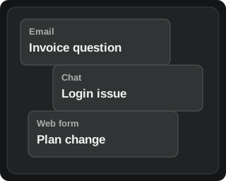 |
Customer requests arrive in separate inboxes. | When requests arrive in different inboxes, keeping track of who handles each one becomes difficult. |
8–15 secProduct introduction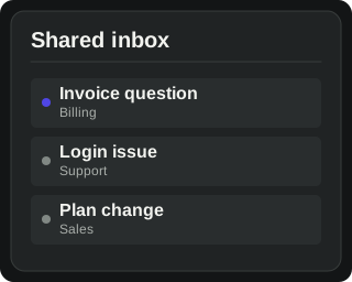 |
Introduce the product's shared workspace. | Bring customer requests together in one workspace. |
15–30 secSetup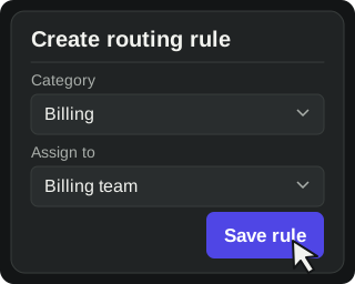 |
Create a routing rule, select a category and destination team, then save it. | Create a rule that sends requests in a selected category to the right team. |
30–44 secProduct response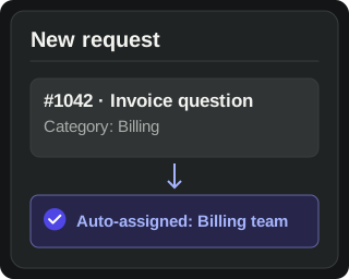 |
A request matching the rule arrives and is assigned. | When a matching request arrives, it is automatically assigned to that team. |
44–54 secResult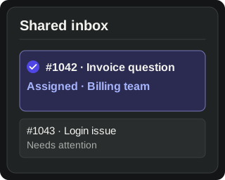 |
Highlight the assigned team and updated queue. | Requests reach the right team without manual sorting, and the queue shows what still needs attention. |
54–60 secNext step |
End card with the product name and a “Try the demo” button. | Try routing a sample request yourself. |
This example leaves room for pauses while the interface changes and the viewer reads the result. Test the timing with a rough voiceover and storyboard before animation begins.
The storyboard below breaks this script into six visual stages.

An illustrative 60-second product demo storyboard, from the initial customer problem to the final call to action.
The critical moment is the transition between saving the rule and seeing a matching request assigned. Without that connection, the viewer might understand how to navigate the dashboard without understanding what the automation actually does.
Reusable product demo script template
Adapt this structure to your own software. Treat the timings as a starting point rather than a fixed requirement.
0–8 seconds: Problem
- Visual: Show [the current problem].
- Narration: Explain what [target audience] struggles with.
8–15 seconds: Product introduction
- Visual: Introduce [the relevant interface].
- Narration: Explain how [product name] addresses the problem.
15–30 seconds: Setup
- Visual: Show [the required configuration or user action].
- Narration: Explain what the user needs to do.
30–44 seconds: Product response
- Visual: Demonstrate [what happens after the action].
- Narration: Explain how the software responds.
44–54 seconds: Result
- Visual: Show [the completed task or meaningful change].
- Narration: Explain why the outcome matters.
54–60 seconds: Next step
- Visual: Show the brand and [call to action].
- Narration: Invite the viewer to [try the product, explore a feature, or request a demo].
If the script requires several unrelated workflows to explain the product, it may be worth splitting the content into multiple videos.
6. How to Simplify UI Without Misrepresenting the Product
One of the biggest differences between recording software and designing a product demo is the ability to control visual hierarchy.
A real dashboard might contain navigation, notifications, filters, account menus, tables, and secondary actions. In a video, all of these elements compete for the viewer's attention.
I approach UI adaptation by separating visual presentation, timing, and workflow accuracy.
Visual changes: make important elements easier to read
Crop irrelevant navigation, enlarge the active panel, and reduce the contrast of secondary information.
For example, if the task involves creating an automation rule, the rule configuration panel should receive more visual attention than the surrounding navigation.
Keep the field names and available options recognizable.
Check the composition at the size at which the video will actually appear on the website. An interface that looks readable in a full-screen editing preview may become difficult to read inside a smaller embedded player.
Timing changes: remove unnecessary waiting
Editing allows you to shorten cursor movements, repeated interactions, and loading pauses.
However, the viewer still needs enough time to understand the action and recognize the response.
When an interface changes after a click, avoid cutting immediately to the next scene. Allow the updated state to establish what just happened.
If processing time is relevant to the product's functionality or performance, do not edit it in a way that creates a misleading impression of speed.
Workflow accuracy: preserve the required steps
This is where visual simplification has a limit.
If activating an automation requires a confirmation or approval step, the animation should not imply that the software activates it without that step.
Likewise, unavailable features should not appear to be already implemented.
Consider an illustrative automation dashboard:
- The original interface contains navigation, rule history, account settings, and a rule editor.
- The video composition enlarges the rule editor and makes surrounding information secondary.
- The user still selects the required conditions, completes the necessary configuration steps, and saves the rule.
- The demonstration ends with the result of that workflow.
The comparison below shows how the same fictional interface can be reframed for video without changing its controls or functionality.
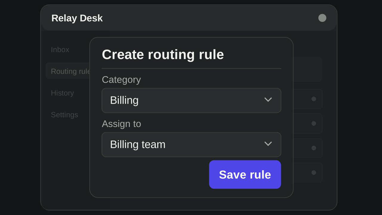
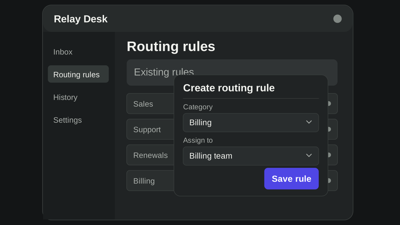
Before: The original interface shows the routing form alongside the rest of the dashboard.
After: The active panel receives more space, while the required controls and workflow remain unchanged.
The visual composition has changed. The product's behavior has not.
This is the distinction I recommend maintaining when turning an existing software interface into an animated product demo.
For website feature loops and interface motion, explore our UI animation for SaaS service.
7. Common Product Demo Video Mistakes
Important text becomes unreadable
Check the video at its intended embedded size, not only at full screen. If a field name or status is essential to the explanation, give it enough space to remain readable.
The interface changes without a visible cause
Show the interaction that triggers a new state. If the cursor selects a filter, the viewer should be able to connect that selection with the updated results.
The cursor moves too much
Remove pointer movements that do not contribute to the task. The cursor should direct attention to relevant interactions rather than compete with them.
Narration introduces information faster than the interface can explain it
Review the script against the storyboard. Avoid introducing a second feature while the viewer still needs to understand the previous interaction.
The video never shows the completed task
Include the final state: an assigned request, an updated report, a confirmed booking, or another visible result. Do not end the sequence immediately after clicking a button.
Animation hides important product limitations
Review the storyboard with someone who knows the software. Confirm that the displayed controls, permissions, required steps, and outcomes accurately represent the product.
These checks are easier to make during storyboard development than after the animation has been completed.
8. How to Prepare Your Product for Video Production
You do not need a finished script before contacting a motion designer.
Product demo video brief checklist
Start with the following information:
- Target audience and their main problem.
- The task viewers should understand after watching.
- Where the video will be displayed.
- The product workflow and necessary interface states.
- Access to the live software, approved Figma files, or screen recordings.
- Required steps that must not be removed.
- Confidential information or customer data that needs to be replaced.
- Voiceover, sound, and subtitle requirements.
- Delivery formats and expected deadline.
- The action viewers should take afterward.
A screen recording of the actual workflow can be a useful reference, even if the final video will be fully animated.
Prepare a representative demo environment
Before recording or sharing access, create a demo account with realistic fictional data and the correct permissions. Set up the exact starting state for the workflow, turn off unrelated notifications, and confirm that each required feature is available in the version being demonstrated.
Agree on which product version the video will show. If a release is planned during production, flag the screens and assets most likely to change before animation starts.
Review the export before publishing
Check the video on the actual destination page at mobile size, with sound off and with captions when provided. Ask a colleague unfamiliar with the workflow to explain what the user did and what changed. Confirm the final product states and call to action with the product team, then verify that playback and the intended next step work on the published page.
For budget planning and comparing production proposals, see my guide to SaaS explainer video costs.
9. How to Measure Product Demo Video Performance
Decide what the viewer should do after watching before you choose the metrics. A homepage demo might lead to a trial or a demo request; a help-center walkthrough might aim to help the viewer complete a task.
Use comparable measurement windows and consistent definitions. For an embedded video, these are useful starting points:
- Play rate: sessions with a play divided by sessions in which the video was shown, multiplied by 100.
- Average percentage watched: the average share of the video watched, using your player’s definition and a consistent treatment of repeat viewing.
- Drop-off points: passages where viewers stop watching. Review the corresponding scenes for unreadable text, confusing transitions, or information that does not serve the task.
- CTA conversion rate: sessions with a defined target action after playing divided by sessions with a play, multiplied by 100. Use the same session scope for both counts.
Viewing data and conversion events can suggest which scenes to revise, but a higher conversion rate among video viewers does not prove that the video caused the difference. When possible, test comparable versions under similar conditions.
For additional production and distribution considerations, see Vimeo’s software demo guide.
10. Frequently Asked Questions
How long should a SaaS product demo video be?
For a focused marketing demo, I would start with 45 to 90 seconds. A silent website loop can be much shorter, while a walkthrough that teaches several tasks may need more time.
The workflow and intended audience should determine the final duration.
Can I create a product demo using only Figma files?
Yes, if the designs accurately represent the intended functionality. Features that are still in development should be presented as such.
Should a SaaS demo video include voiceover?
Not necessarily. Website feature animations can communicate through visible actions and interface feedback. Voiceover can help when the workflow requires additional context or explanation.
Planning a Demo for Your SaaS Product?
Send me your product link and the workflow you want to show. I'll review the scope and discuss your project estimate by email. No calls required.